Wednesday 28 March 2012

Relativity - Folie Final Exhibition Panels


Panel 1
Panel 2
Panel 3


Folie Progression

Starting off with the idea of using several large concrete cubes formed into a ‘mound’ that appears heavy, artificial, intimidating etc. we evolved the design several time to enhance the sense of discomfort, or self unimportance.

Realising that our folie could only be a maximum of 5m high and that the existing elements on the site (the Story Bridge and the Cliffs) dwarfed this, we decided to take advantage of the cliff face to enhance the use of intimidating scale.

By putting the folie against the cliffs and having a slit cut into the roof, only a small amount of light can penetrate the space, drawing the occupants’ attention. By looking up and out of the slice, the occupant can see the vast height of the cliff face, immediately becoming humbled by the intimidating form.
By cutting into the cliff face and using the natural rock face as part of the design also enhanced the disturbing feeling of helplessness and isolation.

To develop the disconnection to reality, and to eliminate light from a doorway, it was decided that the entrance should be an experience where the occupant must walk through an angled corridor to enter the cavernous space inside. To increase the sense of height of the cliffs, it was also decided that this entrance way should lead down a flight of stairs.

Concerned that an occupant would not receive the message of how small they and their problems are in comparison to the rest of the world, it was decided that the internal space should be fitted with invisible screens that flicker to life when the space is occupied. It is designed so that a small screen comes to life showing real time footage of the occupant in the space, then this small screen is dominated with numerous larger screens illustrating historic achievements and devastations, putting into perspective the occupant, deconstructing the self-centred point of view.

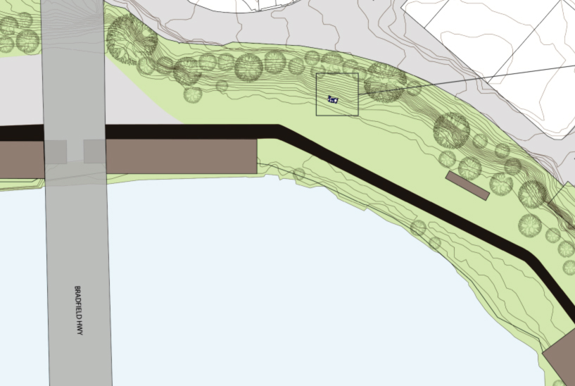
When determining the exact location to put the folie, we discussed what should be seen when looking up through the slit in the roof, and what should be seen when exiting the bridge. From these conditions, we sought a space along the cliff with limited vegetation and where the Story Bridge would be seen upon exit, reiterating the images on grand scale achievements from the screens.

The folie can be seen in the small box at the base of the cliffs


To relate the folie back to the site yet maintaining a distorted perspective, it was also determined that distorted reflective metal, like that of the “Bean” in Chicago, would be mixed with the concrete blocks on the exterior.


Sketches of concept


Because of the limited time frame, there was little room for design development. Below are some concept sketches of my understanding of our concept.


The first one plays with the use of stairs and ideas of unobtainable goals, creating a sense of uneasiness thus making the occupant feel uncomfortable in the space subconsciously decreasing ones feeling of self worth.


The second also uses stairs, the odd and uneven flight requires the user to become aware of their journey upwards. Scale is also used with a large pavilion seeming to be floating almost in the air with impossibly small supports.
Both designs would be made entirely of concrete, an artificial, cold and unwelcoming material.

Development of concept


After deciding that the learning concept we felt was the strongest was altering one’s self perception/importance, we worked with what architecturally could produce this feeling. We explored ideas about scale, optical illusions and perspectives but decided that scale was the strongest feature and would be vital in the final folie.

Referring to the design principles, aspects that the group felt best represented insignificance were materials that are heavy, solid, hard and artificial using dark colours. It was decided that the form should incorporate this materials in a large scale dark form that is disturbing and intimidating to visit. Another element that was decided upon was the lack of views, or controlled views. The use of stairs was also explored a lot, as stairs they would assist to the scale and subconsciously make a user react.

Wednesday 14 March 2012

Project One: Exemplars and Ideas

To come up with our design we first brainstormed ideas on what our folie could teach people. I also researched exemplar folies to inspire me.

The first idea that the grouped explored was a space that taught people about sustainability. We researched ideas such as community gardens, solar energy systems and also wind power.
Exemplars I found in this subject matter are the PhotoBioReactor by BIOS and Deedee Morrison’s sculptures that use photovoltaic’s to produce light.

I like the natural form of the PhotoBioReactor and admire how it is both functional and aesthetic. 

Deedee Morrison’s sculptures are (mostly) aesthetically pleasing and stand out dominantly in their surroundings making them attractions.  The use of photovoltaic’s is a smart and simple way to produce energy and by using these it teaches people that clean energy is simple and easy.

Another interesting idea we had was the use of sound. We looked at exemplars that utilised natural wind to create sound and man-made sound.

This example of the Wind Pavilion uses the wind to flow through tubes to create sound, altering with different speeds and directions teaching viewers about sound and wind. With the very short time period for the project however, creating something this complex would not be feasible.  

The Souffle folie by Hold Up Architecture in France is a very cool example of man-made sound.  It converts vibrations into a visual representation projected onto the roof. 

Interactive spaces were something that we were really interested in. Volkswagon’s Fun Theory experiments were something that I particularly appreciate so we considered doing something interactive and fun like the piano stairs for our folie. However, we were trying to create a destination with our folie, not a transition space so something similar to this would not have been successful.

Adaptability was another option our group explored. We investigated things that would be user interactive with possibilities for multi-functions/purposes. The Prada Transformer acting as a fusion of architecture, art, film and fashion is an excellent example of this. It acts as a rotatable structure, with each side of the form acting as a space for a different function, e.g. a cinema area, a catwalk etc. Unfortunately, we determined that the maximum space of the folie (5mx5mx5m) was too small to allow for anything similar to this.

Form wise, I really like the stacked look of the Digital Origami Emergency Shelter. I like how all the layers add up to form the overall shape, perhaps we could use something like this in our final design.


The Jinhua Architecture Park was also something that took my interest when researching exemplar follies. The seventeen pavilions are aesthetically appealing and a designed in memoriam to the poet Ai Qing. I thought these were all interesting forms that influenced visitors and the way they use the pavilions. 

The next idea of learning that we investigated was perspectives and perception, or ‘things may not appear to be what they seem’. We looked at using metaphors, optical illusions and scales etc to create a fun based folie. I found an exemplar which I felt physically represented this well, The Impossible Statue in Belgium is an optical illusion that appears to be different shapes from different angles, only appearing as the illusion from one angle or perspective.


Tuesday 13 March 2012

Project One: Folie


Project 1: Folie
From my understanding, a folie is a distinct sculpture or small building (e.g. a pavilion) that activates a space.
For project one, we are required to design a folie for the Howard Smith Wharves site in small groups with the following guidelines:
·        The folie needs to be/provide a learning space
·        It must accommodate at least two people
·        It must fit in an area of 5mx5mx5m

Design criteria:
·        CONCEPT: The folie requires a strong concept that can be portrayed as a narrative which explains the folie and its background
·        CONTEXT: The folie should demonstrate an understanding of the immediate context, including; social, cultural, political, geographical and historical.
·        FUNCTION: The folie needs to provide interior and exterior spaces that provoke learning.
·        TECTONIC: The folie requires a simple yet creative use of structural members and materials. Structural details and drawings should be included on the final panels.
·        EXPERIENCE: The folie should be an unique space. Graphical expressions of how people use the space should be included on the final panels (eg. photo montages, collages, diagrams, tones and colours etc.)

Design qualities to be communicated in the design:
·        Tension/compression
·        Heavy/light
·        Solid/void
·        Bright/dark
·        Natural/artificial
·        Soft/hard
·        Comfortable/disturbing
·        Materials
·        Structural details

Sunday 11 March 2012

The Site: Howard Smith Wharves


The purpose of this blog is to act as a Project Development log. Here I will be documenting my work for the DAB510 - Architectural Design 5 unit. 

All three pieces of assessment have the prescribed site of Howard Smith Wharves, a now desolate area under the Story Bridge. 

The Site
Image: Google Earth, accessed March 7, 2012. Edited by Kirsten Landsberry.

Before the 2010 floods the site was home to a walkway, some historical storage sheds and air-raid shelters. The devastating floods inundated the site destroying the walkway and forcing redevelopment plans for the area to be withdrawn, leaving the site inaccessible to the public and a blank canvas along the vastly populated river edge.

Existing Buildings on Site
Image: Google Earth, accessed March 7, 2012. Edited by Kirsten Landsberry. 

Enclosed by the vertical cliff face on the North and the Brisbane River on the South, the site has a fairly flat topography.

Exposed to detrimental natural elements from the South West (afternoon Summer Sun, Harsh South Westerly winds etc.), the proposed structure needs to be appropriately designed to benefit from these conditions. Also influential are the potential summer breezes coming through the site from the East and South East; these would be enhanced, cooled off the river. Depending on the exact positioning of the structure, the morning Winter sun could also be captured. 

Natural Elements
Image: Google Earth, accessed March 7, 2012. Edited by Kirsten Landsberry. 

Being positioned on prime real estate there is a plentiful of pleasing views from the site. Views of the Brisbane River, opposite cliffs, the Story Bridge are all ample. Steeped in history, the historical buildings of the site also offer views.


Views to and from site
Image: Google Earth, accessed March 7, 2012. Edited by Kirsten Landsberry. 

Given the position of the site there are also many views to the site.

Image of seat along river by Kirsten Landsberry

This seat along the river's edge provides a place to sit and view the Howard Smith Wharves.

Image of Site from opposite side of river by Kirsten Landsberry.

This is the view of the site from the seat in the photo above.